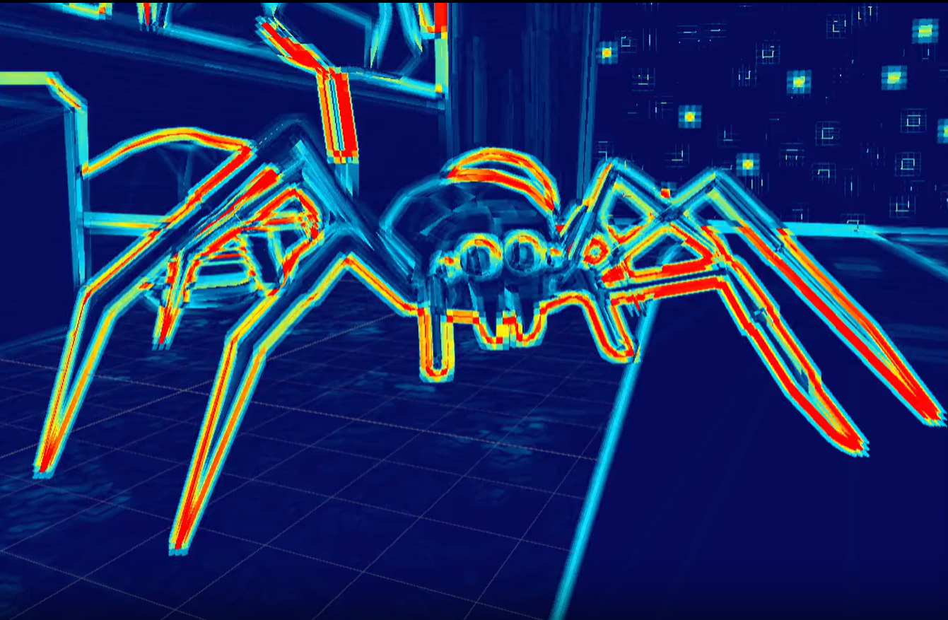
Before a player understands the level, its mechanics, or even where to go, they have to read the image. Shapes and color work together to establish visual hierarchy and guide attention.
A big part of that is getting our final art to be as readable to the player as the original blockmesh.
This raises a practical question: how can we evaluate that readability while building the level?
Level readability depends on several factors, including color perception, object shapes, and the relationships between them. This article isolates one part of that problem: color perception.
One artist checks the frame in grayscale. Another watches luminance. A third desaturates the image and looks at hue and chroma separately. All three are checking contrast, but they are not measuring the same thing. They can reach three different conclusions and all be correct.
I wanted one tool that made those answers visible in the final rendered frame. I started with a grayscale shader. I ended up with a perceptual lightness and color-separation checker built around OKlab.
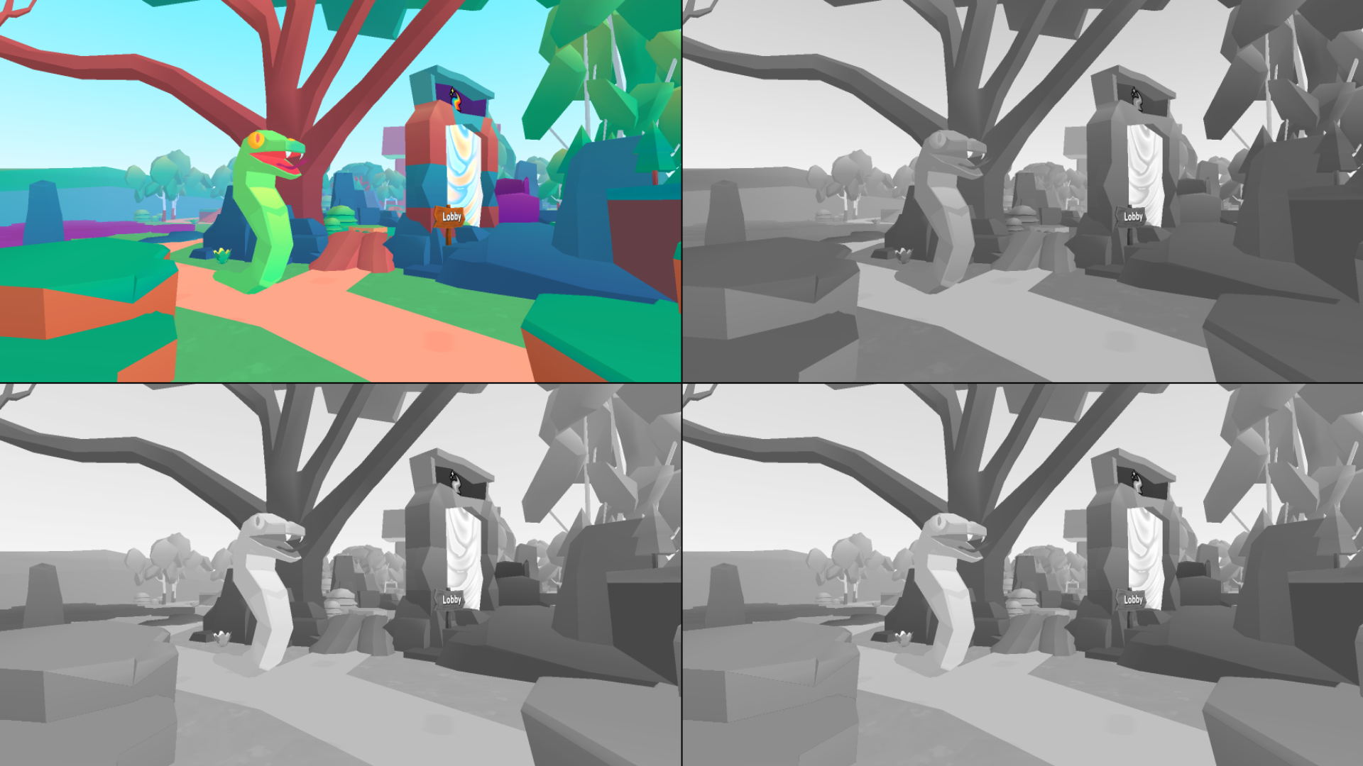
Grayscale is not one operation
The quickest grayscale conversion is an RGB average:
float gray = (color.r + color.g + color.b) / 3.0;It looks plausible until the input contains saturated colors. Pure red, green, and blue all produce the same value: 0.333. Our eyes do not agree. Green appears much lighter than blue.
Rec.709 relative luminance is a better answer when the question is about light:
Y = 0.2126 R + 0.7152 G + 0.0722 BThe calculation uses linear RGB. It gives green the largest contribution and blue the smallest. This is useful, but Y is still linear relative luminance. It is not perceptual lightness.
That distinction matters in art reviews. “Value” may mean an RGB number, HSV V, luminance, perceived lightness, or local separation from nearby pixels. The word compresses several different questions into one convenient syllable.
The first job of my tool is not to pick a winner. It is to stop those questions from pretending to be identical.
Why OKlab became the center of the tool
OKlab represents a color with three coordinates:
L — perceptual lightness
a — green/red opponent axis
b — blue/yellow opponent axis
This gave me more than a better grayscale conversion. It gave every diagnostic mode a shared language.
I built a simple interactive model to show how OKlab works in the tool. Move the sliders to see how each coordinate changes the result:
For a perceptual grayscale view, I keep L, set a and b to zero, then convert the neutral color back to RGB:
float3 lab = LinearSrgbToOklab(linearRgb);
float3 neutral = OklabToLinearSrgb(float3(lab.x, 0.0, 0.0));
L is not a display-ready gray value. Converting (L, 0, 0) back through OKlab preserves the meaning of the space and produces the correct neutral output.
The full path is short:
final scene RGB
→ linear sRGB
→ OKlab
→ measure L, a, and b
→ convert the selected result back to RGB
For the complete matrices and derivation, see the original OKlab article.
The interesting failure: a chroma fight
The most useful surprise appeared when I tested two saturated colors with nearly equal OKlab lightness.
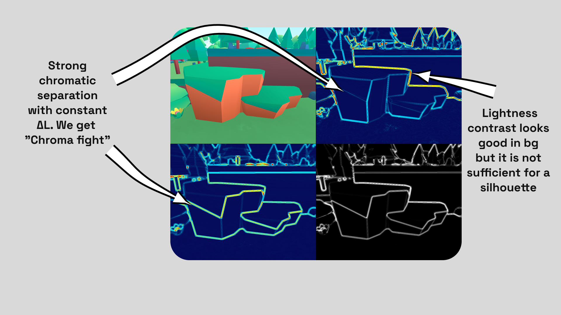
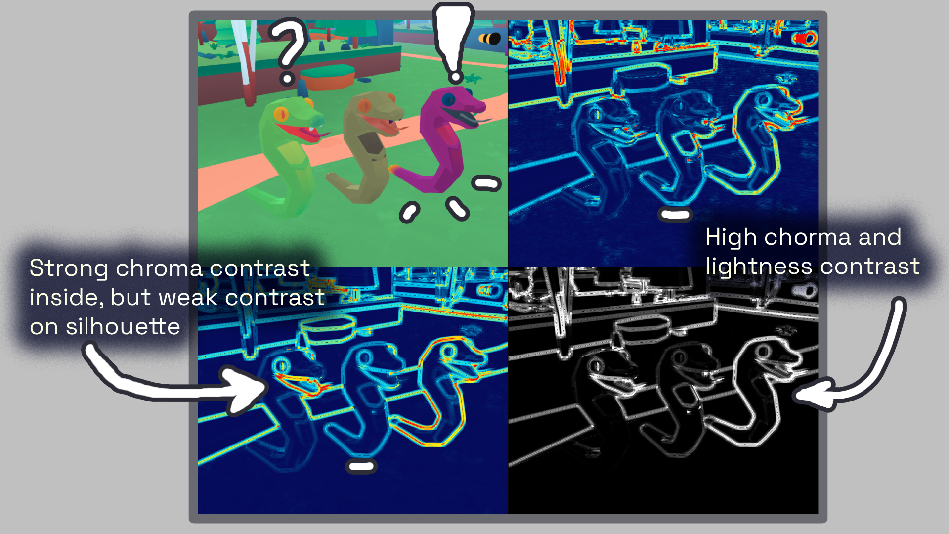
The OKLAB L view made their boundary weak. In color, the boundary was impossible to ignore. The colors seemed to fight along the edge.
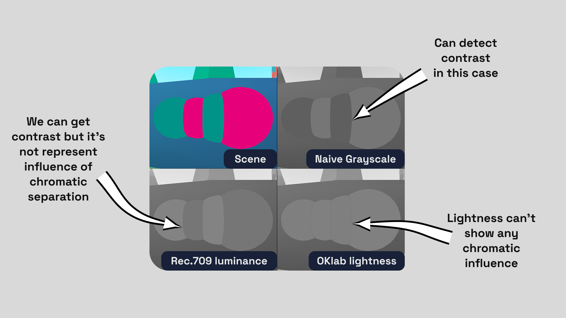
I call this a chroma fight. It happens when lightness says “almost the same,” while the opponent-color channels say “far apart.” A lightness-only checker misses it because it is doing exactly what I asked: removing color.
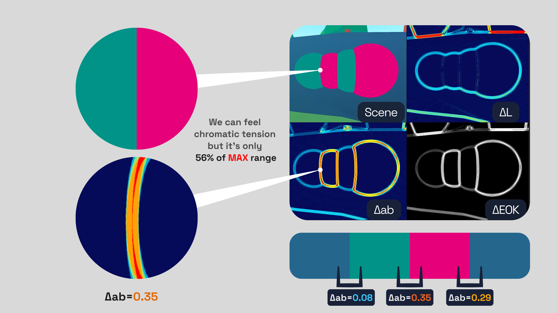
In this heatmap, values are clamped to the 0–1 range. Dark blue represents a small Δ, while red represents a Δ close to 1. In this example, I increased the gain for both ΔL and Δab to make the contrast easier to see.
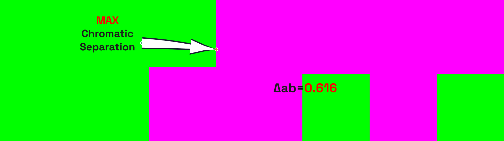
The maximum possible chromatic separation between two sRGB colors is Δab ≈ 0.61651, between 00FF00 and FF00FF. I found it by calculating the OKLab Euclidean distance between all primary vertices. Pure green and magenta are the furthest apart.
Look at how tense the boundary feels.
That failure changed the tool. The goal was no longer to find the one correct grayscale image. The goal was to separate the signals, inspect each one, and then combine them without confusing their meanings.
From a pixel value to a local comparison
A full-frame lightness image still leaves the artist searching for the problem. I wanted the tool to point at boundaries where separation was weak or strong.
For each pixel, I compare its OKlab value with the average of eight neighbouring samples. The radius is measured in pixels and can be changed in the UI.
The first diagnostic is local lightness contrast:
ΔL = |Lcenter − Lneighbourhood|Small ΔL means the center is close to its surroundings in perceptual lightness. Large ΔL marks a strong lightness transition.
The second diagnostic measures separation in the a/b plane. Here, Δa and Δb are the differences between the center pixel and the local neighbourhood average:
Δab = √(Δa² + Δb²)This catches the chroma fight. More precisely, it measures local chromatic separation caused by hue, chroma, or both. I expose it as a heatmap for quick scanning and as monochrome for comparison with ΔL.
The radius changes the scale of the question. Two pixels reveal thin edges and texture. Thirty pixels respond to broader separation between a character and the environment. There is no universal radius because visibility itself is scale-dependent.
One combined result, with an honest name
Once the scene is in OKlab, combining the channels is simple. The ΔEOK color difference is Euclidean distance across L, a, and b:
ΔEOK = √(ΔL² + Δa² + Δb²)I calculate that distance between the center pixel and its local neighbourhood. Then I map the score to a neutral OKlab gray:
black → little local perceptual separation
white → strong local perceptual separation
This produces the summary view I wanted. Lightness affects the result. Hue and chroma affect it too. A red object does not receive some fixed arbitrary shade of gray. Instead, a red–green boundary becomes brighter when the local color difference is strong.
I call this mode a readability proxy, not a readability verdict. It knows nothing about enemies, focal points, motion, visual noise, object size, or the player’s intent. It measures local perceptual color separation. That is one useful part of readability, not the whole problem.
The distinction keeps the tool practical. It can show where the frame deserves inspection without pretending to replace an artist.
In Ultimate Evolution, shortcuts connect different parts of a level and support the player’s movement. The player needs to recognize them immediately.
READABILITY PROXY ΔEOK mode.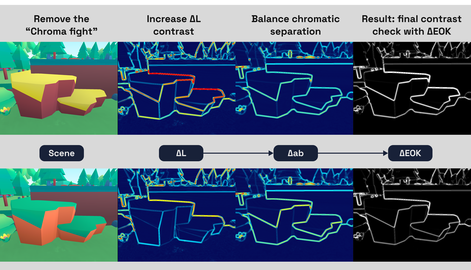
The analysis led me to change the color scheme. The new colors increased local ΔEOK and made the shortcut easier to distinguish from its surroundings.
The modes answer different questions
The final checker contains several views, but each earns its place:
| Mode | Question |
|---|---|
NORMAL | What does the final graded frame look like? |
NAIVE RGB | What does the simplest grayscale conversion hide or distort? |
REC.709 Y | What is the frame’s linear relative luminance distribution? |
OKLAB L | What remains when hue and chroma are removed while perceptual lightness is retained? |
LOCAL ΔL | Where are local lightness transitions weak or strong? |
CHROMATIC Δab | Where does color separation carry the image? |
READABILITY PROXY ΔEOK | Where is local separation strong when all three OKlab coordinates contribute? |
The four-way comparison puts color, naive grayscale, Rec.709 Y, and OKlab L on screen at once. It is the quickest way to resolve a vague discussion about “values.”
The local views are for the next question: where does the separation come from?
Measure the frame the player will see
The checker runs in Unity 6 with URP. I inject its fullscreen pass at AfterRenderingPostProcessing, after the main post-processing stage. Unity documents this injection point as after post-processing and before the final AfterRendering pass.
This order is important. I want to inspect the result after lighting, fog, color grading, exposure, and tone mapping have made their contribution. Running earlier would diagnose an intermediate image rather than the frame under review.
lighting
→ fog
→ post-processing and grading
→ exposure / tone mapping
→ perceptual checker
→ display
The shader also supports both Gamma and Linear Unity projects. OKlab and Rec.709 calculations require linear sRGB input, but Unity does not deliver sampled camera color in the same representation in both workflows.
In a Gamma project, I explicitly decode before analysis and encode the result for output. In a Linear project, the GPU normally performs the relevant sRGB conversion when sampling and writing the target. Decoding a second time would corrupt the result.
I use UNITY_COLORSPACE_GAMMA to select the path automatically. There is no checkbox for someone to forget after changing the project settings.
A better art-review conversation
The tool supports a short review loop:
Normal
→ OKlab lightness
→ local lightness contrast
→ local chromatic contrast
→ combined ΔEOK
→ Normal
To show this loop in practice, I used the checker to inspect how ambient occlusion changed the scene and why the result looked better.
AO mainly changes lightness because it uses multiplicative color blending. Its effect therefore appears most clearly in the ΔL view.
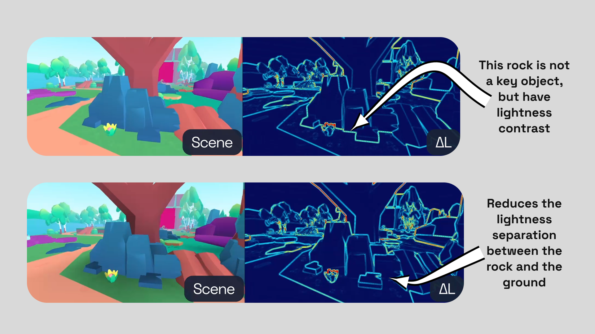
My custom vertex AO reduces the lightness separation between the blue rock and the ground, so the rock blends into its surroundings in the ΔL view. That is useful here: the rock is not an interaction target, and lower contrast keeps it from competing for attention. I want the player to notice the purple hexagons on the left instead. They have strong chromatic separation but weak lightness separation. The combined ΔEOK view lets me judge whether that color contrast is enough or whether I also need to adjust their lightness.
It gives us a common language for looking at the same frame.
If an art director says, “separate the character from the background,” I can ask what currently carries the silhouette. Is it lightness? Color? Both? Does the separation survive the final grade? Is it strong only at the scale of texture, or across the whole character?
Sometimes the answer is to change the lighting. Sometimes it is to move the hues apart. Sometimes the colors are already fighting too hard and need less chromatic tension. The tool does not make that decision. It shows which signal the current result depends on.
I started by trying to build a more correct grayscale filter. That was the wrong endpoint. Naive RGB, Rec.709 luminance, OKlab lightness, local ΔL, chromatic Δab, and combined ΔEOK are all valid answers to different questions.
Summary
- Grayscale is not a single measurement. RGB average, Rec.709 luminance, and perceptual lightness answer different questions.
- OKlab gives the tool one coordinate system for lightness, chromatic separation, and their combined distance.
ΔLreveals local lightness contrast.Δabcatches boundaries carried by color, including the chroma fight that grayscale removes.- Local
ΔEOKcombines all three OKlab coordinates into one black-and-white separation map. - The result is a readability proxy, not a pass/fail test. It shows which signal deserves a closer look in the final graded frame.
The checker does not explain every part of level readability. It does replace “the values feel wrong” with a question I can test.
References
- Björn Ottosson, A perceptual color space for image processing
- W3C, CSS Color 4: ΔEOK color difference
- Unity Manual, Full Screen Pass Renderer Feature reference for URP
- Unity Manual, Write a render pass using the Render Graph system in URP
- ITU-R, Recommendation BT.709