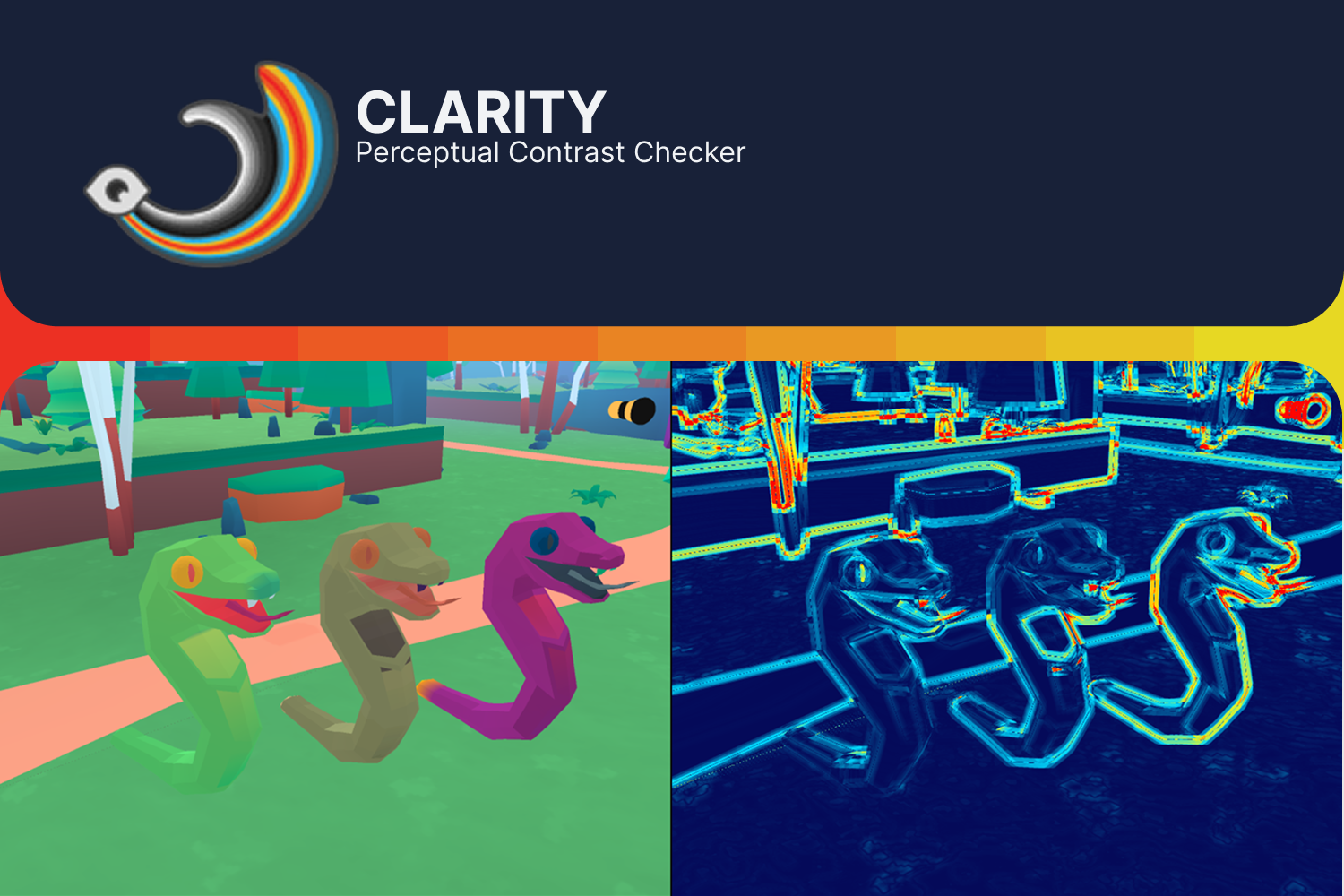
 Clarity is a full-screen diagnostic tool for Unity 6 URP. I built it to inspect scene readability without leaving the Scene or Game view.
The tool shows how the final rendered frame is structured by lightness and color contrast. It can compare several grayscale interpretations, isolate local contrast, and reveal boundaries that exist only because of hue or chroma.
This is the practical overview of the tool. I covered the color model, the shader logic, and the failure that changed the design in What Grayscale Misses: Checking Level Readability with OKlab in Unity.
The problem Clarity is meant to solve
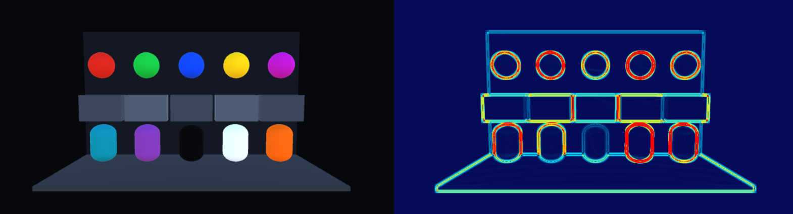 An image can look polished and still communicate the wrong hierarchy.
The player character may merge with the background. A decorative rock may attract more attention than an interactable object. Two areas may look distinct in color but collapse when their lightness is compared. The opposite can happen too: grayscale may hide a strong boundary carried entirely by color.
These problems are hard to discuss when every person means something different by “value” or “contrast.” A grayscale screenshot gives one answer, but it does not explain what produced that answer.
I wanted a tool that could split the frame into separate signals while I was still working on the scene:
- perceptual lightness;
- physical relative luminance;
- local lightness separation;
- local chromatic separation;
- combined perceptual color difference.
Clarity keeps those signals separate. It does not try to declare one of them correct.

It works on the rendered image
Clarity analyzes camera color as a full-screen URP pass. This means I can inspect the result after lighting, fog, post-processing, color grading, and the rest of the scene pipeline have shaped the image.
That distinction matters. A material color can be well separated in isolation and disappear after exposure or grading. A lighting change can improve a silhouette without changing the material. Clarity shows the composed frame rather than the inputs that produced it.
The same visualization appears in the Scene and Game views. I can edit the level, move the camera, change a light, or adjust a material and see the diagnostic result immediately.
Image comparison modes
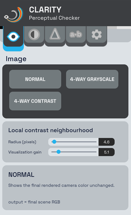 The first group is for quick comparisons.
NORMAL returns to the unmodified camera image.
4-WAY GRAYSCALE places four versions of the frame on screen at once:
- the original color image;
- a naive average of the sRGB channels;
- Rec. 709 relative luminance;
- OKLab perceptual lightness.
This view is useful when a review gets stuck on the word “value.” The four images make it clear that a simple grayscale conversion, physical luminance, and perceived lightness answer different questions.
4-WAY CONTRAST compares the original image with three local measurements:
- lightness difference;
- chromatic difference;
- combined OKLab distance.
I use this view to identify which signal carries an edge before opening a single diagnostic full-screen.
Perceptual color views
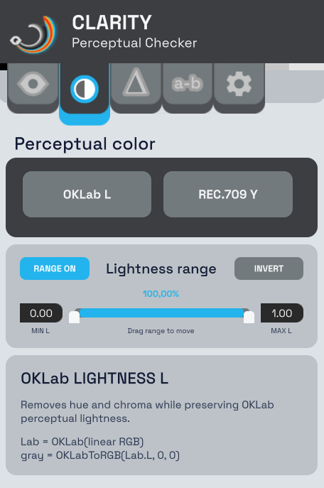
OKLab L removes hue and chroma while preserving perceptual lightness. This is my main view for checking the broad value structure of a level.
REC.709 Y shows linear relative luminance. It is useful when I need to inspect the light emitted or reflected by the rendered image rather than approximate how light or dark the colors appear.
Clarity also includes a lightness-range filter. I can select an interval of OKLab L and isolate pixels inside or outside it. This helps me find large parts of the frame occupying the same lightness band. It is also useful for checking whether an important element stays in a distinct range as the camera moves.
The range is a diagnostic selection, not a segmentation tool. It knows nothing about objects or materials. It only sees the rendered pixels.
Local contrast views
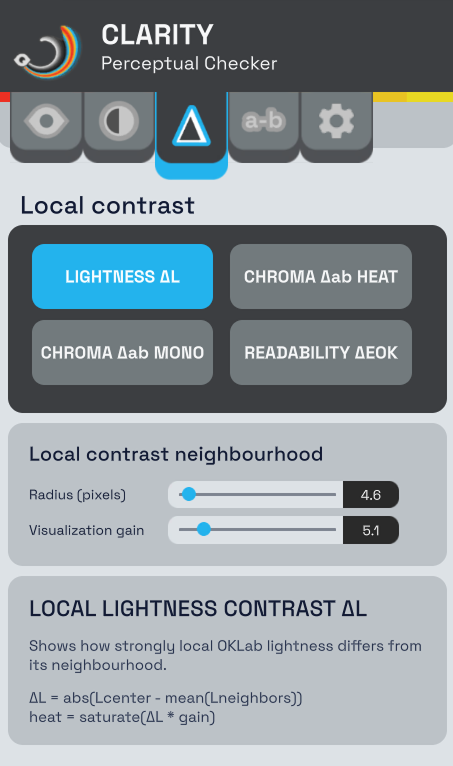 A full-frame lightness image still leaves me searching for the exact boundary that fails. The local modes compare every pixel with eight nearby samples.
The radius controls the scale of that comparison. A small radius reacts to thin edges and texture. A larger radius responds to broader separation between a subject and its surroundings.
The gain controls how strongly the result is displayed. It helps reveal small differences, but it does not create more separation in the scene. I keep that distinction in mind when comparing revisions.
Clarity provides four local views.
Lightness contrast
LIGHTNESS ΔL shows the local difference in OKLab lightness. Strong transitions appear clearly. Similar-lightness regions remain dark even if their hues are far apart.
I use it to check silhouettes, focal points, paths, and large compositional groups. It also exposes cases where texture creates plenty of small contrast while the larger shape still disappears.
Chromatic contrast
CHROMA Δab HEAT shows local separation in the two OKLab opponent-color axes. It reveals boundaries carried by hue, chroma, or both.
The heatmap is useful for scanning the frame quickly. CHROMA Δab MONO presents the same measurement as neutral grayscale, which makes it easier to compare with ΔL.
This is the view that catches what grayscale removes. Two colors can have almost equal lightness and still form a clear boundary. Clarity makes that contribution visible instead of treating it as noise.
Readability proxy
READABILITY ΔEOK combines local lightness and chromatic difference into one grayscale result. Dark areas have little local perceptual color separation. Bright areas have more.
I call it a readability proxy deliberately. It is a compact summary, not a verdict.
The mode does not know which object matters. It does not understand composition, motion, gameplay, semantic importance, visual noise, or accessibility requirements. A bright edge can belong to the player, a decal, or an irrelevant pebble. The map tells me where separation exists. I still decide whether it supports the scene.
Comparing two colors directly
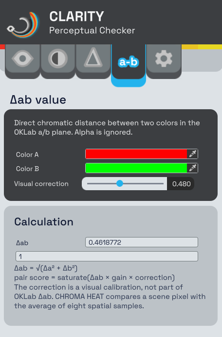 The
The Δab value page compares two selected sRGB colors without sampling the scene. It reports their chromatic separation and previews the score used by the visualization.
I use it while choosing material colors or investigating a boundary found in the chromatic view. It gives me a controlled comparison before lighting and grading change the pair in the rendered frame.
The scene view remains the final check. Two swatches cannot reproduce their surrounding colors, scale, lighting, or post-processing.
My review loop
I normally use Clarity as a short loop rather than searching for a pass/fail result:
Normal frame
→ 4-way grayscale
→ local lightness contrast
→ chromatic contrast
→ readability proxy
→ normal frame
The first pass tells me whether the broad hierarchy survives without color. The local views show where the separation comes from. Returning to the normal frame prevents me from optimizing the diagnostic image instead of the game.
When I find a weak or competing boundary, I can change the light, material, fog, grade, or composition and repeat the loop. Clarity does not prescribe the fix. It makes the effect of the fix easier to see.
Setup in a URP project
Clarity requires Unity 6 and the matching Universal Render Pipeline version. It supports both the Render Graph path and URP Compatibility Mode. Built-in Render Pipeline and HDRP are not supported.
After importing the complete Assets/HordorDev/Clarity folder, I open the window from Tools > Clarity > Open Window.
If the active default Universal Renderer Data asset does not contain the feature, the window shows an Add Clarity button. The tool names the asset before making the change and asks for confirmation. The operation supports Undo. Importing the package by itself never changes renderer assets.
The Renderer Feature can also be added manually from its Inspector. Camera settings control whether it affects Scene View and Game cameras. Preview and reflection cameras are skipped.
The included demo scene contains vivid hues, low-contrast surfaces, similar-lightness colors, and near-black and near-white references. It is a quick way to learn what each visualization responds to without modifying an existing scene.
Editor and Development Builds
The main interface is a dockable Editor window. A compact Scene View overlay is available but hidden by default, so I can enable it only when I want faster mode switching.
The Game view stays free of additional controls while running inside the Editor. In Development Builds, Clarity creates a small runtime overlay automatically. F8 cycles the main modes. F7 hides or shows the overlay.
Release builds do not create that overlay automatically. The full-screen pass still has a rendering cost, so the feature should normally be disabled in shipping configurations.
What Clarity cannot tell me
Clarity performs image-space analysis. Its result depends on the rendered camera image, project color space, post-processing, resolution, sampling radius, and visualization gain.
It does not identify objects. It cannot decide that the player must stand out while a background prop should recede. It cannot measure narrative importance or replace an accessibility review. Camera motion and animation can also change readability in ways that a single frame does not describe.
Those limits are part of the design. I did not build an automatic art director. I built a set of views that replaces one vague question — “does the scene read?” — with several smaller questions I can inspect and discuss.
Summary
- Clarity inspects perceptual lightness, luminance, and local color contrast in Unity 6 URP.
- It analyzes the rendered camera image in both Scene and Game views.
- Four-way comparisons show why grayscale, luminance, lightness, and chromatic separation should not be treated as the same signal.
- Adjustable local views reveal whether a boundary is carried by lightness, color, or both.
- The combined
ΔEOKmode is a readability proxy, not an object-aware score. - The tool supports Render Graph and Compatibility Mode, plus an optional runtime overlay in Development Builds.
Clarity gives me evidence for an art decision. The decision remains mine.