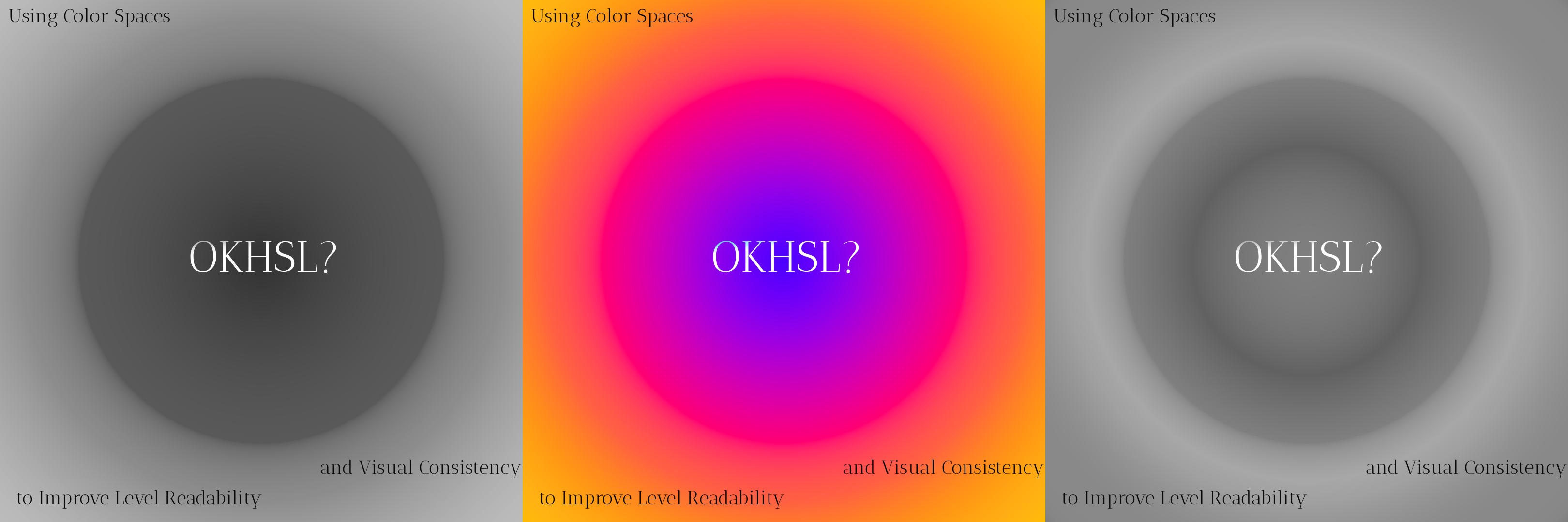
A level can become hard to read when important objects do not stand out from their surroundings. A visual variation can create the same problem. The new palette may look interesting, but the hierarchy that guided the player can disappear with it.
I kept returning to two questions while working on Ultimate Evolution:
- How can I inspect the value structure of the final rendered frame?
- How can I generate visual variations without destroying that structure?
I first treated these as separate problems. One belonged to art review. The other belonged to procedural tools. Learning about OKlab connected them.
It did not give me one finished solution. It gave me a shared model for several tools I wanted to build.
This article is a map of those ideas. I will keep the color science short. Björn Ottosson explains the model and its math in the original OKlab article. I am more interested in what the model suggests for a technical-art workflow.
The problem beneath both questions
I asked experienced concept artists and animators what makes a scene read clearly. Most gave me the same answer: contrast.
That answer is correct, but it hides several different signals. Shape can separate one object from another. Lightness can establish a hierarchy. Hue and chroma can carry a boundary even when two colors have similar lightness. Scale and context change which of those differences the player notices.
In this article, I use lightness for the measurable coordinate and leave the distinction between it and artistic value to Value vs. Lightness.
RGB is useful for storage and display. HSV is convenient for familiar controls. Neither gives me coordinates that map cleanly to the questions I want to ask during art production.
OKlab represents a color with three coordinates:
L — perceptual lightness
a — green/red opponent axis
b — blue/yellow opponent axis
OKLCh expresses the same model as lightness, chroma, and hue. Okhsl provides another interface designed for color picking. These representations do not make an art decision for me. They separate the controls well enough to turn that decision into a tool.
Idea 1: inspect lightness in the final frame
The first idea was a perceptual lightness checker.
Artists often desaturate an image to inspect its value structure. I wanted the same feedback inside Unity, after lighting, fog, grading, and other effects had contributed to the frame. That would remove the screenshot loop and make comparison part of the normal scene-review workflow.
My first assumption was simple: convert the frame to OKlab, inspect L, and get a more useful grayscale image.
That worked, but the failure was more interesting than the result. Two objects can have similar lightness and still form a strong boundary through hue or chroma. A lightness-only view removes the signal that carries that boundary. The tool therefore grew from a grayscale filter into a set of separate lightness and chromatic-contrast views.
That implementation became its own article. I return to it at the end of this one.
Idea 2: generate palette variations with explicit constraints
The second idea came from the same separation of coordinates.
When I create another visual variant of a level, I do not want to recolor every asset independently. I want rules that preserve the relationships which matter. A background may occupy one lightness range. An interactable object may need a minimum separation from that background. A new palette can move through different hues while those constraints remain visible and measurable.
OKLCh gives this experiment a useful structure. I can hold L approximately constant while changing hue, or control chroma separately from lightness. Okhsl may be useful when the tool needs a familiar artist-facing picker.
This is not a guarantee of visual consistency. Colors can leave the target RGB gamut, and local context still affects perception. Gamut mapping and scene-level validation remain part of the problem. The useful change is that the generator can express its intent instead of scattering unrelated RGB offsets across assets.
I have not turned this into a production palette system yet. For now, it is a concrete design direction with clear constraints to test.
Idea 3: build gradients around the intended color path
The third idea is gradient generation.
Interpolating RGB components is mathematically simple, but the middle of the gradient may not follow the perceptual transition I intended. It can lose chroma, shift through an unwanted hue, or change lightness unevenly.
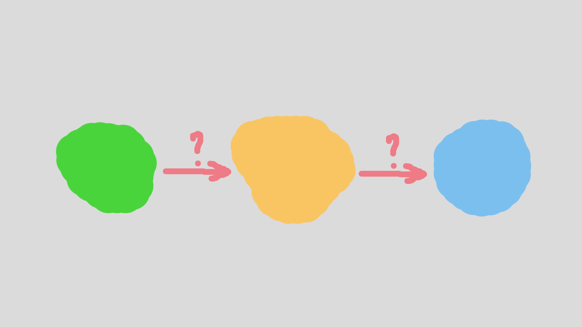
I repeated the interpolation in OKlab. The transition produced a more even perceptual change between the source colors. That does not make OKlab the correct choice for every gradient. Sometimes an uneven or physically motivated transition is exactly what the effect needs. The interpolation space should follow the artistic purpose.
Unity already exposes this idea through its Perceptual Blend gradient mode, which interpolates stops in OKlab. I want to extend the same choice to tools that bake gradient textures and to color ramps evaluated in shaders.
Idea 4: move the same controls into runtime effects
The last idea is more experimental.
If palette tools and gradient tools use the same perceptual coordinates, runtime effects can expose them too. Fog, world variants, and color grading could share controls for lightness, chroma, and hue instead of each effect inventing its own RGB adjustments.
Converting every pixel to and from OKlab has a cost. A production version may need a baked LUT or a cheaper approximation. I have not measured that path yet, so I treat it as a hypothesis rather than an optimization. The test is clear: compare the approximation with the full conversion, measure the frame cost, and decide whether the error is acceptable for the effect.
One model, several tools
These ideas are not a single universal color pipeline. They are several tools built around the same questions:
What should remain stable?
→ lightness, chroma, hue, or local separation
→ choose the representation and constraint
→ generate or inspect the result
→ validate it in the final frame
The shared model matters because the tools can speak the same language. A palette generator can target a lightness relationship. A gradient baker can preserve a chosen transition. A frame debugger can show whether the final lighting and grading kept that relationship intact.
OKlab does not solve level readability. It knows nothing about enemies, interaction, motion, composition, or player intent. It gives me better coordinates for one part of the problem: perceptual color relationships.
That distinction changed what I built first.
I started with what I thought would be a more correct grayscale filter. I ended up with a tool that shows why grayscale alone is incomplete. The next article covers that implementation, the failure that changed its design, and the Unity render feature I now use to inspect the final frame:
What Grayscale Misses: Checking Level Readability with OKlab in Unity
Summary
- OKlab gave me a shared model for several technical-art problems rather than one automatic solution.
- Perceptual lightness can improve value inspection, but lightness alone misses boundaries carried by hue and chroma.
- OKLCh and Okhsl suggest more explicit controls for palette generation, with gamut mapping and scene validation still required.
- OKlab interpolation is useful for gradients when an even perceptual transition matches the artistic goal.
- The first idea I implemented became a broader readability checker, which I cover in the next article.
References
- Björn Ottosson, A perceptual color space for image processing
- Björn Ottosson, Two new color spaces for color picking: Okhsv and Okhsl
- Unity Manual, Select colors and color gradients